ISSUE NO. 56
A September Issue

Photography by Lorenzo Zandri
A huge thank you to everyone who has already preordered Interior Identity—your support means the world. The book is slated for release on November 3rd, and I can’t wait to share it with you.
If you missed the preorder window, copies will be available to order starting November 17th.
ARCHITECTURALLY CURIOUS
Pointing, politely

Photography by Lorenzo Zandri
The extension immediately sets a different rhythm. Pale brick is used not just as structure but as sculpture, with softened curves that catch light differently than the flat Victorian walls beside it. A low concrete planter at the base grounds the composition, bridging the line between garden and architecture. It’s the kind of detail that signals a home designed for both durability and delight.

Photography by Lorenzo Zandri
Pointing In Your Direction
Inside, the story shifts upward. The ceiling folds into a series of faceted planes, as though carved by hand, creating pockets of shadow that feel almost weightless. Instead of adding ornament, the geometry itself becomes decoration, a quiet play of angles above oak joinery and flowing curtains. It’s a reminder that architecture can be sculptural without being loud.

Photography by Lorenzo Zandri
All Points Lead Somewhere
At the center of the plan, a marble island anchors the kitchen with its bold, veined surface—more monolith than countertop. Behind it, a deep arched alcove frames the sink and shelves, repeating the curve seen in the ceiling and extension. Tall oak-framed doors flood the space with natural light, leading directly into the garden. Every element seems tuned toward hosting—made to hold both conversation and celebration.
GLOBAL GLIMPSE
Tucked Away

Photography by Yoshi Makino
In a corner wrapped in patterned wallpaper, the breakfast nook sets the tone for how this home marries intimacy with drama. The banquette curves around a heavy wood table, while spindle-back chairs anchor the space in tradition. Above, a paper lantern softens the geometry, casting a warm glow against the deep greens of the wallpaper. It’s a space designed for pause—proof that even in a home of scale, there are corners for quiet.

Photography by Yoshi Makino
In The Bedroom
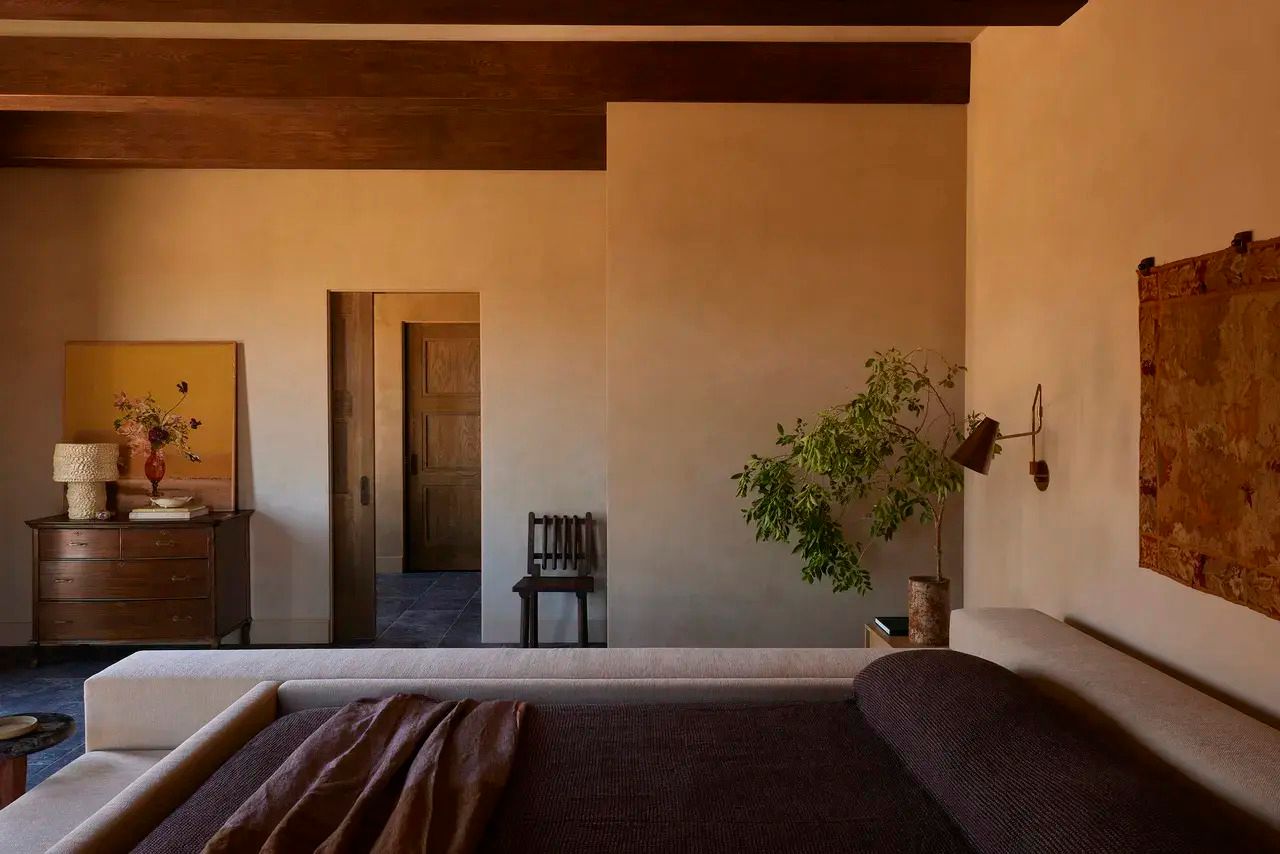
The tone shifts—pared back, serene, and tactile. Plaster walls hold a matte finish that seems to absorb desert light, while exposed beams span across the ceiling, grounding the room in material honesty. A mix of antiques—like a classic dresser and vintage wall tapestry—adds narrative weight, offset by organic touches like a leafy branch in a stone vase. Every detail here suggests restraint, where comfort is found in proportion, texture, and atmosphere.

Photography by Yoshi Makino
But First, A Quick Snack
The kitchen is where the desert influence comes alive. A scalloped brick ceiling, hand-laid in warm red tones, references the surrounding cliffs and canyons. Cabinetry stained in deep blues contrasts against marble counters, while brass fixtures punctuate the palette with brightness. Pendant lights drop in with playful geometry, ensuring the space feels both sculptural and functional—a modern interpretation of a landscape that refuses to be tamed.
DESIGNER PICK— HoneyBook [ad]
Save Time →Download HoneyBook’s Guide
I’ve partnered with HoneyBook—my behind-the-scenes business partner that saves me hours every week. In under a minute, a new inquiry becomes a live project: name the project, add the client, schedule the intro call, load my kickoff tasks, generate the proposal/contract/invoice, activate the client portal, and send an AI-drafted welcome—while automations handle all the reminders. Audit your time, automate the busywork, and focus on what matters: the client experience.
MUSICAL INTERLUDE
What I'm Listening to in September
Cheers to the fall season—I’ll see you next week, my friend.
Warmly,
/shane


